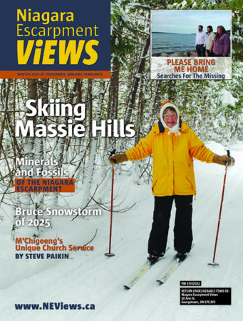
The winter issue is at the printer. For me, that means I have a few days to dig down to the top of my desk and work on other assignments, some of which I’ve had to put off while I finalize and proof the magazine.
For Mike, it means organizing and finalizing our mailing lists and deciding our Canada Post distribution of free copies. We try to change the free distribution each issue, in order to introduce the magazine to as many people as possible.
The cover of our winter issue is a little unusual for us. At first I had been thinking of going with a traditional, beautiful Christmas theme. But then I thought it looked a little predictable and – well, sleepy. I keep trying to improve our covers to make them more arresting, interesting, irresistable even.
Then I took a closer look at one of the photos we’re using in our icewine feature. It’s an entertainer portraying Jack Frost, so he has white makeup covering his face, and he’s…I’ll just say he’s engaged in an unusual, colourful activity. As well as being an interesting photo, it also has the right technical composition for a magazine cover. There’s a science as well as an art to a good magazine cover, and I aim to apply all the rules and ideas I can.
One thing I insist on with our covers: they have to be “real journalism.” They have to be photographs of what is actually contained in our issues. I don’t want to use stock photography that anyone can access. Our covers are the work of photographers who illustrate our features and departments. A photo in our magazine has been taken by someone we know, usually for a specific assignment. We’re the real deal. Our covers are not just pretty pictures that have nothing to do with our contents. Our covers are meant to show you what you’ll find inside.
Do you agree with this approach, or am I being too uptight? What do you think a good cover should be like? Is there a cover you remember as being particularly striking? I mean any magazine, any time, not just ours.


4 Comments
Gloria, I applaud your philosophy. Stock photos have their place, but you are right that readers want to see a reflection of what’s inside. And I like that you are in effect shopping locally by having the photos taken by people you know. Bravo!
I’m in total agreement with you. The readers would think the cover was a fraud if it did not concern inside content. Keep the integrity of Escarpment Views intact & we’ll keep reading.
Hi Gloria,
I love the idea that the covers have been specifically designed for each edition. I know a lot of thought has gone into choosing every photograph you include – not only on the covers , but to illustrate the articles inside.
Please keep up the good work.
Gloria,
EV’s covers are some of the most effective I’ve seen: you’re not being too uptight! Integrity wins hands down.
I think the best covers are those that draw you into another world (as in *View* — probably your idea in the first place!)
congrats on every issue
Julia